Skip to content

Generate 2K 9:16 exploration draft posters for the HUMAN FRAGMENTS 2026 editorial typography series

HUMAN FRAGMENTS 2026 Vertical Editorial Typography Poster Workflow

This workflow produces 2K 9:16 exploration draft posters that embed human daily moments, movement, and city spaces directly into oversized typography rather than placing imagery behind flat text. All outputs are initial creative drafts, not final production print files.

Asset
Integrated lifestyle typography poster draft
Format
Model default · 2K
Model
Doubao Seedream 5.0 Lite

8 credits per image

Your references, identity direction, and approved creative context stay reusable inside the Project.

Sample generatedGenerated with · Doubao Seedream 5.0 LiteUpdated · Jul 29, 2026
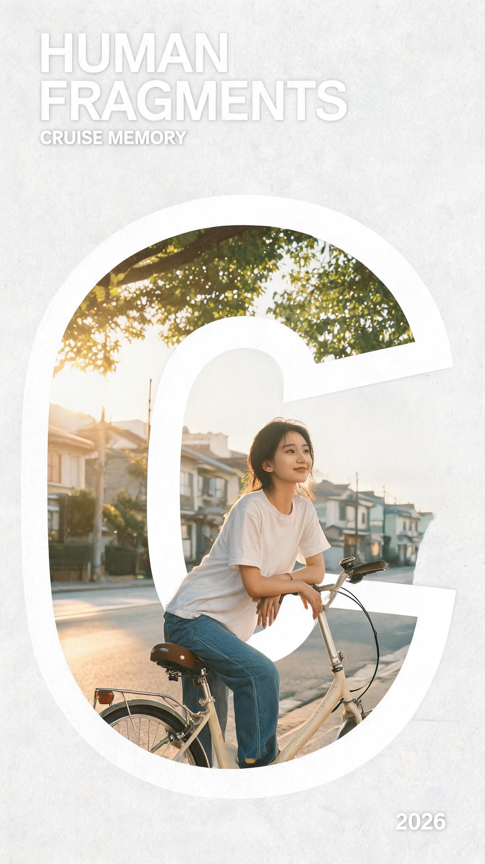
HUMAN FRAGMENTS 2026 Vertical Editorial Typography Poster Workflow generated example 1
2K · Model default
OUTPUT 01 / 02

REVIEW REQUIRED
Integrated typography and scene · Minimal layout compliance

Generated output

Inspect the result before you put it to work.

Check the main subject, framing, material detail, and channel requirements at full size before handoff.

HUMAN FRAGMENTS 2026 Vertical Editorial Typography Poster Workflow generated example 1
Generated result · inspect at full size before handoff

What this recipe creates

A repeatable integrated lifestyle typography poster draft workflow.

Built for the 2026 HUMAN FRAGMENTS poster series, this process outputs minimal editorial layouts with only the series title, short supporting line, and 2026 date, paired with realistic photographic rendering, subtle paper grain, and intentional negative space.

  • 2K 9:16 exploration draft poster
  • Integrated typography + lifestyle scene render
  • 4 distinct visual direction variant previews
  • Layout with only required text elements
Vertical social media campaign assetsLimited run zine cover artGallery show promotional prints

Required inputs

  1. Custom poster main title text
  2. Selected subject demographic
  3. Chosen human movement theme
  4. Defined color palette

How it works

Review the workflow before you create.

4

Use each step as a review gate. If one gate fails, change that input before spending another generation.

01 / STEP

Generate MOTION STEP direction poster variant

Select the MOTION STEP visual direction to prioritize dynamic perspective, with a foreground foot close to the camera and the human figure breaking through the edges of the oversized title letters.

Quality check · Confirm the figure intersects at least two edges of the main title letterforms, no flat text overlay sits on top of the person
02 / STEP

Generate CITY TRACE direction poster variant

Select the CITY TRACE visual direction to use a low camera angle, with a single walking subject and urban street architecture fully embedded inside the shape of the large typography.

Quality check · Verify no street or person elements appear fully outside the bounds of the main title letters, negative space around the poster edges is uncluttered
03 / STEP

Generate CRUISE MEMORY direction poster variant

Select the CRUISE MEMORY visual direction to render a quiet everyday moment with a person and bicycle, lit by soft warm natural light, with small lifestyle details woven directly into the letterforms.

Quality check · Confirm subtle paper grain is visible across the full frame, no fake logos or watermarks appear on the bicycle or surrounding scene
04 / STEP

Generate PULSE FORM direction poster variant

Select the PULSE FORM visual direction to render expressive full body movement in monochrome, paired with bold thick typography and one single restrained accent color.

Quality check · Check that only one non-monochrome color appears across the entire poster, no extra unplanned accent hues are added

Recommended model and tested settings

Tested setup and quality gates.

Model
Doubao Seedream 5.0 Lite · doubao-seedream-5-0-lite-260128
Style
All outputs are 2K 9:16 aspect ratio exploration drafts, no verified print color calibration is included in the generation
Resolution
2K
Guidance
This workflow is not tested for other model versions, results may vary if used on alternate image generation platforms
Tested
Jul 29, 2026

Quality checklist

Integrated typography and sceneNo flat opaque text layer sits on top of the lifestyle scene; imagery appears inside, through, or overlapping the edges of the oversized letterforms
Minimal layout complianceOnly three text elements appear on the poster: the custom main title, the HUMAN FRAGMENTS series line, and the 2026 year mark, no extra unrequested text is present
Photographic rendering consistencyNatural skin and hair texture, no over-smooth plastic skin, subtle uniform paper grain across the full 2K frame
Negative space balanceAt least 30% of the total poster area is clean empty negative space around the main typography and scene, no cluttered extra decorative elements
No unwanted assetsNo fake logos, barcodes, URLs, watermarks, or pre-made generic poster template borders appear anywhere in the output

Common failure modes

Know what to correct before the next run.

FAILURE / 01

Typography is fully opaque, with the entire lifestyle scene placed behind the text

Add a specific instruction that the figure breaks through the top, bottom, and side edges of the main title letters, and reduce the text weight prompt value by 20%

FAILURE / 02

Generated text has distorted, unreadable, or misspelled letterforms

Shorten your custom main title to 5 characters or less, and re-run the generation with no extra text-related keywords added

FAILURE / 03

Output includes unrequested logos, brand marks, or watermarks

Add an explicit negative prompt entry for logos, watermarks, and brand marks, and re-generate

FAILURE / 04

Human figure anatomy is distorted, with extra limbs or broken movement

Reduce the requested perspective exaggeration, and reference a single clear walking or movement pose in your input prompt

FAQ

Production notes.

No, all outputs from this workflow are initial exploration drafts. You will need to adjust text kerning, color calibration, and final typography alignment in a separate design tool before sending to print.

Lock your custom title text to 6 characters or fewer for the main oversized typography, and avoid adding extra text prompts beyond the required series name, supporting line, and 2026 date.

Yes, you can cycle through each of the four defined visual directions with different subject, color palette, and custom title inputs to build a full matching poster set.

This happens when the generation prioritizes text legibility over integrated composition by default. Adjust your input to explicitly state that the figure breaks through the top and bottom edges of the main title letters.