Skip to content

Generate conceptual experimental graphic poster drafts exploring the practical uses of centipedes for academic and creative research

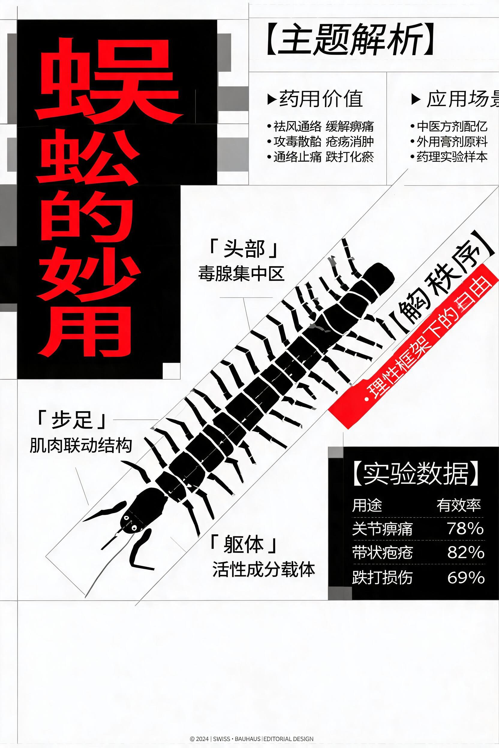
Centipede Themed Avant-Garde Experimental Editorial Poster

This workflow outputs a 2K conceptual graphic poster draft exploring the practical uses of centipedes, built using combined principles of Swiss grid design, Dada collage, postmodern experimental typography, and a restrained monochrome base with single accent color palette.

Asset
2K avant-garde graphic design exploration draft
Format
Model default · 2K
Model
Doubao Seedream 5.0 Lite

8 credits per image

Your references, identity direction, and approved creative context stay reusable inside the Project.

Sample generatedGenerated with · Doubao Seedream 5.0 LiteUpdated · Jul 29, 2026
Centipede Themed Avant-Garde Experimental Editorial Poster generated example 1
2K · Model default
OUTPUT 01 / 02

REVIEW REQUIRED
Restrained Palette Compliance · Grid Alignment Consistency

Generated output

Inspect the result before you put it to work.

Check the main subject, framing, material detail, and channel requirements at full size before handoff.

Centipede Themed Avant-Garde Experimental Editorial Poster generated example 1
Generated result · inspect at full size before handoff

What this recipe creates

A repeatable 2k avant-garde graphic design exploration draft workflow.

All outputs are exploration drafts, not final production assets, that balance rational modular grid structure with intentional deconstructed elements to create layered multi-path reading experiences for academic, exhibition, or independent editorial projects.

  • 2K resolution conceptual poster draft
  • Layered typography layout exploration
  • Monochrome base with single accent color palette test
  • Asymmetric balanced composition variant
Avant-garde graphic design research projectsSmall-run academic exhibition print displaysIndependent zine cover and spread drafts

Required inputs

  1. Core factual content points about centipede practical uses
  2. 1 high-contrast saturated accent color of your choice
  3. Selected serif and sans-serif font pair references
  4. Modular grid dimension parameters

How it works

Review the workflow before you create.

4

Use each step as a review gate. If one gate fails, change that input before spending another generation.

01 / STEP

Set Base Palette and Accent Color Parameters

Start by defining your full monochrome black, white, and grayscale base range, then select one single high-saturation high-brightness accent color to use for all visual break elements. Do not add any additional secondary colors to the prompt.

Quality check · No extra colors appear anywhere on the canvas, 90% of the total canvas area uses only grayscale values
02 / STEP

Map Modular Grid and Deconstruction Boundaries

Define a 12-column base modular grid for all core text elements, then mark 2-3 small zones where elements are allowed to cross grid lines to create intentional deconstructed tension.

Quality check · 80% of all layout elements align to the grid, only the pre-marked zones contain elements that extend past grid boundaries
03 / STEP

Configure Typography Contrast Rules

Specify your chosen serif and sans-serif font pair, set a 10x size difference between the largest display headline and smallest footnote text, and mark 1-2 text blocks to be set at a 15-30 degree slant for dynamic emphasis.

Quality check · No more than two distinct font families appear, the extreme size contrast between large and small text is clearly visible
04 / STEP

Anchor Core Visual Element to Golden Ratio Point

Place your primary stylized centipede visual anchor at the pre-calculated golden ratio intersection point of the canvas, then arrange all surrounding text and collage elements to radiate out from that point.

Quality check · The eye is drawn first to the anchor element at the golden ratio point, no competing secondary visual anchors appear elsewhere on the canvas

Recommended model and tested settings

Tested setup and quality gates.

Model
Doubao Seedream 5.0 Lite · doubao-seedream-5-0-lite-260128
Style
This workflow is calibrated for the 2K verified output size, outputs at larger resolutions may show unexpected layout distortion
Resolution
2K
Guidance
The workflow does not require custom LoRA assets to run, all style rules can be defined directly in the generation prompt
Tested
Jul 29, 2026

Quality checklist

Restrained Palette Compliance90% of the canvas uses only grayscale values, with exactly one high-saturation accent color used for all highlight elements, no extra unplanned colors are present
Grid Alignment Consistency80% of all layout elements lock to the defined modular grid, with only pre-specified small zones containing elements that cross grid boundaries
Typography Contrast ClarityThe serif and sans-serif font pair is clearly distinguishable, the extreme size difference between large display text and small footnote text creates a clear multi-level reading path
Asymmetric BalanceThe composition does not use central symmetry, but the total visual weight across the left and right halves of the canvas feels evenly distributed
No Illegible Generated TextAll rendered text characters are clearly readable, no distorted or nonsensical glyphs appear in any text block

Common failure modes

Know what to correct before the next run.

FAILURE / 01

Multiple random extra colors appear across the canvas outside of the defined grayscale and single accent palette

Reduce the total allowed color count explicitly in your prompt, and re-run generation with a lower creativity value setting

FAILURE / 02

All layout elements are completely unaligned to the modular grid, no consistent structure is visible

Move the modular grid alignment rule to the very first line of your prompt, and re-run generation

FAILURE / 03

All text elements are distorted, with unreadable nonsense glyphs replacing intended characters

Remove all specific text content from the generation prompt, generate only the layout structure, then add your actual text manually in a graphic editor

FAILURE / 04

The composition feels cluttered, no clear primary visual anchor draws the eye

Reduce the total number of accent color elements to 3 or fewer, and re-run generation to recenter visual weight on the golden ratio anchor point

FAQ

Production notes.

No, all outputs from this workflow are conceptual exploration drafts. You will need to manually refine typography alignment, fix any distorted text, and adjust layout details in a vector editor before using the asset for final print.

Common issues include misaligned text that does not follow the grid, unplanned extra accent colors, distorted typography, and generated illegible text characters. All of these can be corrected in post processing.

Yes, you can reuse the same palette, grid rules, and typography parameters across multiple generations to create a consistent visual system, though you will need to manually align cross-page elements to avoid layout inconsistency.

The restrained single accent palette is a core part of the design logic that creates the contrast between calm grayscale order and sharp localized visual impact, preventing the dense layout from becoming visually cluttered.