Skip to content

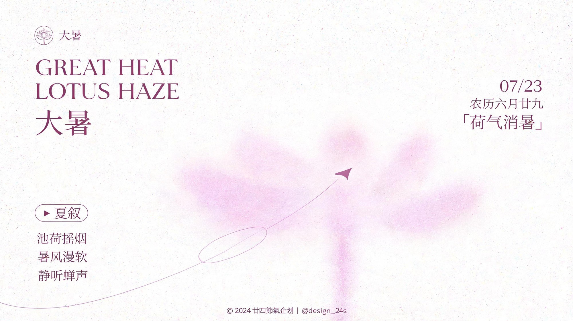
Generate 10 distinct 2K 16:9 Great Heat solar term airy minimalist info posters with unique summer motifs, color palettes and copy sets

10 Distinct 2K Airy Great Heat Solar Term Poster Set

This workflow outputs 10 separate 16:9 2K exploration draft posters for the Great Heat solar term, each with a unique summer visual motif, custom low-saturation color scheme, and original copy arrangement.

Asset
2K 16:9 poster exploration drafts
Format
Model default · 2K
Model
Doubao Seedream 5.0 Lite

8 credits per image

Your references, identity direction, and approved creative context stay reusable inside the Project.

Sample generatedGenerated with · Doubao Seedream 5.0 LiteUpdated · Jul 29, 2026
10 Distinct 2K Airy Great Heat Solar Term Poster Set generated example 1
2K · Model default
OUTPUT 01 / 02

REVIEW REQUIRED
High brightness negative space ratio · Motif translation accuracy

Generated output

Inspect the result before you put it to work.

Check the main subject, framing, material detail, and channel requirements at full size before handoff.

10 Distinct 2K Airy Great Heat Solar Term Poster Set generated example 1
Generated result · inspect at full size before handoff

What this recipe creates

A repeatable 2k 16:9 poster exploration drafts workflow.

All posters follow a consistent soft, high-brightness layout framework with large near-white negative space, blurred translucent color fog elements, subtle fine grain texture, and asymmetric editorial hierarchy, no heavy shadows or harsh gloss.

  • 10 separate 2K 16:9 poster exploration drafts
  • Each draft with unique color palette
  • Each draft with distinct motif translated to soft blurred color fog
  • Consistent fine grain texture across all assets
  • Asymmetric editorial text layout per design
Seasonal solar term social media campaignsIn-store light print promotional displaysBrand newsletter header graphics

Required inputs

  1. 10 distinct summer visual motifs
  2. Core Great Heat solar term copy assets
  3. Custom low-saturation base color for each poster
  4. Subtle accent color for each poster

How it works

Review the workflow before you create.

4

Use each step as a review gate. If one gate fails, change that input before spending another generation.

01 / STEP

Lock the base layout framework for all 10 posters

Start by defining fixed layout zones before adding unique motif details to ensure visual consistency across the full set of assets.

Quality check · All 10 generated drafts place text elements in their assigned zones, no core text overlaps the central lower color fog area.
02 / STEP

Assign unique summer motifs to each poster

Map each of your 10 selected summer motifs to a corresponding low-saturation base color that matches its mood, for example pair ice cream with pale mint, pair lotus with soft pale pink.

Quality check · Each poster's translucent color fog clearly evokes its assigned motif without rendering a sharp, photorealistic version of the subject.
03 / STEP

Add consistent fine grain texture across all outputs

Apply uniform fine micro-grain and subtle color noise to the full canvas of every poster, including all negative space, color fog, and text edges.

Quality check · No areas of the poster show smooth, untextured digital surfaces, no brown discoloration or stain artifacts appear on the near-white background.
04 / STEP

Insert the thin accent curve detail

Add a single thin pale freehand curve that enters from the bottom edge, draws one large loose arc and one small loop, passes through the color fog zone, and does not cross any text elements.

Quality check · The curve does not intersect any title, annotation, or body copy text on any of the 10 drafts.

Recommended model and tested settings

Tested setup and quality gates.

Model
Doubao Seedream 5.0 Lite · doubao-seedream-5-0-lite-260128
Style
This workflow is calibrated for 16:9 2K output, do not override the aspect ratio or resolution settings outside of the specified parameters.
Resolution
2K
Guidance
Outputs may contain minor text rendering errors, all generated text should be reviewed and replaced with your final approved copy before public use.
Tested
Jul 29, 2026

Quality checklist

High brightness negative space ratioMinimum 70% of the total poster canvas is near-white high brightness negative space, no large dark or saturated blocks occupy more than 10% of the frame.
Motif translation accuracyEach assigned summer motif is represented via soft blurred color fog and faint horizontal marks, no sharp photorealistic renderings of the motif appear anywhere on the poster.
Texture consistencyFine uniform micro-grain and subtle color noise covers the full canvas, no smooth untextured areas, no yellowing or stain artifacts on the white background.
Text hierarchy alignmentAll text elements follow the specified asymmetric layout, with high contrast thin serif uppercase English title lines, modern condensed Song style Chinese heading, and small fine print elements placed in their assigned zones.
Color palette complianceAll colors fall within low to mid-low saturation range, no heavy shadows or strong glossy effects appear on any part of the design.

Common failure modes

Know what to correct before the next run.

FAILURE / 01

Sharp photorealistic summer subject (e.g. full clear lotus flower) appears in the lower fog zone

Add the phrase 'no sharp photorealistic subjects, all motif elements are translucent blurred wide color blocks' to the generation prompt and re-run the asset.

FAILURE / 02

Text elements overlap the central lower color fog zone, making copy unreadable

Add explicit text placement rules that all core text sits outside the lower 40% of the canvas except the bottom fine print baseline, re-generate the draft.

FAILURE / 03

Heavy grain or brown discoloration appears on the near-white background

Adjust the texture instruction to specify 'only fine uniform micro grain, no aged paper stains, no yellowing, bright clean white background' and re-run generation.

FAILURE / 04

Two or more posters in the 10-set have identical color palettes

Generate each poster one at a time with its specific assigned base hue written directly into the individual prompt, instead of generating all 10 in a single batch.

FAQ

Production notes.

No, all generated assets are exploration drafts. You will need to manually adjust text kerning, fix any misaligned text elements, and replace generated placeholder text with your final approved copy before using the assets publicly.

This workflow intentionally translates all summer motifs into soft, translucent blurred color fog and faint horizontal marks to preserve the high-negative-space, airy editorial aesthetic, no sharp photorealistic subjects are included in the design brief.

The verified output size is 2K resolution, which is suitable for digital display and small to medium size light print. It does not have enough pixel density for large format outdoor billboards that require 300DPI at full physical size.

Assign each poster a base hue from a different segment of the color wheel, and keep all saturation values below 30% to ensure each palette is distinct while remaining within the required low-saturation aesthetic.